Your Pricing for Low Volume Sales May Be Too Low
The graph below illustrates the relationship between price and annual item volume for one item. Each blue and red dot represents one customer buying the item in the course of the year. You’ll notice the blue dots clustered around the diagonal line. The blue dots are customers buying the item where there is a strong correlation between how much the customer buys and how much they pay. Pricing for these customers is what you’d expect … the more they buy, the less they pay and vice versa.
Then there are the “red dot” customers …
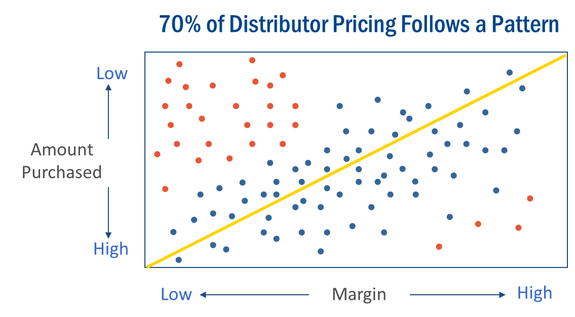
These “Red Dot” customers buy the item once or occasionally. Sometimes pricing for these customers is at higher margin rates (upper right hand corner of graph). However, much of the time, this item is sold to low volume buyers at lower than necessary margins (upper left hand corner).
Profit2’s patented analytical tools analyze the hundreds of thousands of customer/item combinations you sell, identifies those combinations where you have an opportunity to safely increase margin and provides specific recommendations for increasing profits.
As a Profit2 client, our pricing experts help you with every customer-item combination. We identify the items that are at risk and highlight those where you have an opportunity to increase GP$. Our margin consultants do the analysis that you don’t have the time to do. As a result, our clients sell more and increase profits on low volume sales.
Are You Leaving Money on the Table?
To find out more about how the pricing experts at Profit2 can help you determine if you are missing opportunities to safely increase margin, fill out our Contact Us form or call (913) 897-0159.